Web Design Trends Worth Exploring

It’s a great time for Internet users in regards to web design trends. Designers are always coming up with innovative ways to add convenience, visually dazzle, and make the Internet, quite simply, an easier place to navigate. For all the changes that major websites have implemented in the last couple of years (it’s almost impossible to go a week without Facebook or Twitter changing something), important trends are moving many websites to become more intuitive for the casual browser. Some of these trends are so well done, the user probably won’t even notice them. Some trends can’t help but be noticed.
All in all, if you’re looking to improve your site, now’s a great time. Here are five trends that every website should consider putting to use.
Five Cool Web Design Trends
Responsive is a must
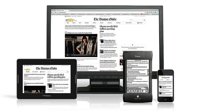
Forget having different websites for different screen sizes – in 2017, if you’re not doing responsive design, you may as well be in 1997. Responsive web designs are easy on the user because they present a site that will be perfect for whatever screen they choose to use, and these days, many users have three or more different screen sizes on which to browse. It’s a must for every website now, and fits right in as one of the trends that are only making the Internet more user-friendly.

Hero Images
You probably have already noticed this one, because it’s impossible to ignore the gigantic headers that characterize the hero images trend. A large, visually striking banner picture can catch and keep attention, making it an easy yet aesthetically pleasing addition to any site.

Innovative Animation
We know, we know: animation’s been around since the dawn of the Internet. We all saw the dancing baby. But the last couple of years have been great for making animation an integral part of the browsing experience. Hover animations make finding out information as simple as moving your cursor over an image; background animation adds extra style to any website; and big, over-the-top animation welcomed users with incredible visual flare. Be warned: animation can be a major distraction, but when used correctly, it can make a major difference.


Micro-interactions
Getting visitors to do things they don’t really think about is the next big thing. Micro-interactions should be like breathing – your visitors should do things naturally without thinking too much about it. Whether it’s sharing, liking, notifying, downloading, or anything that lets the user impact their experience, micro-interactions turn browsing into an experience. They can be so small that the user might not even notice that they’ve used them. For sites looking to get feedback, expand use, and have visitors explore, micro-interactions are wonderful. Getting on board with this trend will help you easily adapt for future trends, too.

Card Layout
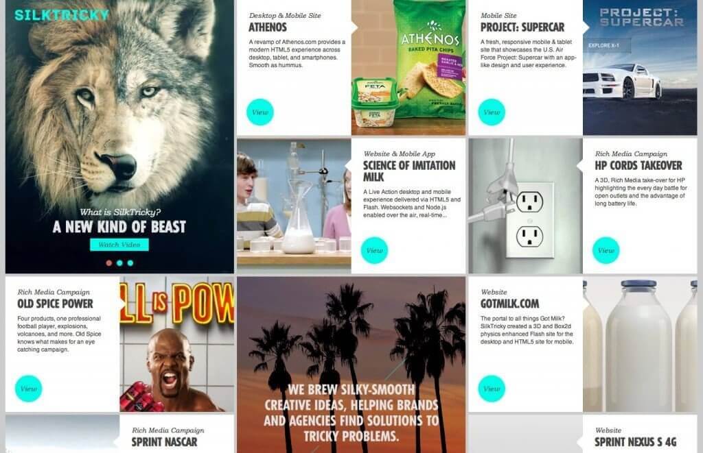
Turns out, in the last couple of years Pinterest might be the site that’s had the most impact on how websites are laid out. Turning stories, information, and pages into chunks, websites can focus on efficient layout, center new and important pages in the eye of the visitor, and make everything efficient yet visually appealing. It’s also a great layout for mobile design. Everything points to card layout being the most enduring trend.
