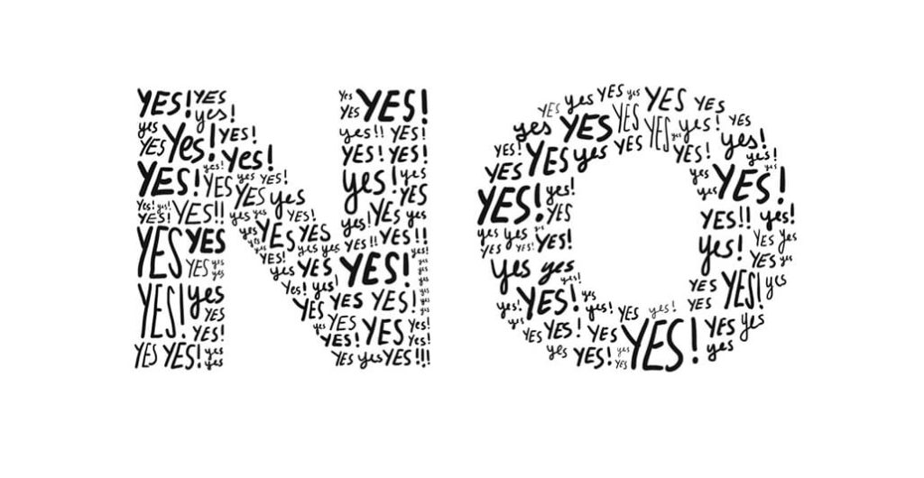
Compelling Copy vs Visual Delivery

Recently, I have had many discussions with web development clients about the value of the written copy for their website. It seems that everyone can understand the value in solid programming, aesthetic design is also a no-brainer for most, but many believe that the written copy on their site should almost be an afterthought. I commonly hear things like “just leave it with placeholder text and I’ll fill it in afterwards”, or something along the lines of 1/10th the design budget. I think the driving factor for this perception is that language is viewed more as a common skill then artwork. Although this is likely at least partially true, writing flawlessly and persuasively within a very limited space, is a skill that requires close attention.
The real problem with neglecting the art of penmanship is that the written copy on the website is equally as important, if not more so, then the actual appearance of it. This, of course, varies industry to industry. The thing to think about when it comes to comparing the value of concisely written, compelling copy verses design and where the budget is best allocated, is the image you want to portray for your digital space and how people will interact with it. The common phrase “a picture is worth 1000 words” is not always best applied in this scenario. In fact, a picture when not accompanied by at least a few words to describe it in the META Data is against Google’s best practice guidelines.
When it comes to putting content online, a picture is worth approximately 16 words which are placed in the alt tag for the image for SEO purposes, plus the value of the feeling people get when viewing it, which is immeasurable. When combined with proper visual delivery written copy can make an impression that could stick in your customer’s head for a day, or even weeks.
My favorite comparison to explain this concept is to think of song lyrics. Every message needs delivery. When written down on paper, lyrics to some of the most engaging songs can seem downright dry. When combined with the voice of the singer and instrumental, which would represent the delivery of the message, these words can resonate with an audience for a lifetime.
Let’s take a look at the hook from Meat Loaf’s classic Two Out of Three Ain’t Bad.
I want you
I need you
But there ain’t no way, I’m ever gonna love you
Now don’t be sad
‘cause two outta three ain’t bad
When written plainly like this, these words would almost never warrant the brain space of any reader. But, when delivered the way it is done in the song, and especially if combined with the video or live performance, you can feel exactly how he is communicating the pain he felt over the loss of his original love and the emotional barricade that resulted from the event. On the flipside, if Marvin Lee Aday were to simply hum the melody over top of an instrumental, there would be no message and I would likely have never heard, nor written about this tune. It is the combination of message and delivery that make it meaningful.
When applying a concept like this to advertising such as online, the same theory is valid. The written words represent the message and the graphics and/or video represent the delivery of the message. If you can capture your audience with a visual and concise statement which forms an immediate connection, you are two-thirds of the way there. However, what you say after that is of critical importance and the copy must be written in a way that is not only interesting, but also speaks to the idea, product, or subscription which you are trying to sell. Your online space must be a complete package including and if there is a weak link anywhere in the chain, the best graphics in the world won’t be able to save you.